glo — British American Tobacco
From Banners to Product Launches — Earning Scope Through Craft
The situation
I joined Geometry Ogilvy Japan as a digital designer. The job was production work — campaign banners, eDMs, LINE creatives, train station posters. My main clients were glo, British American Tobacco's heated tobacco brand, and KODE. At one point, I was making a PowerPoint for the CEO because a colleague was out.
It was not a glamorous start.
But the work was a training ground. Every banner, every poster taught me how to communicate within a brand system under tight constraints. And when the opportunity came, I was ready.
The work
Midway through my contract, I moved from Digital Designer to UX Designer. The scope changed immediately.
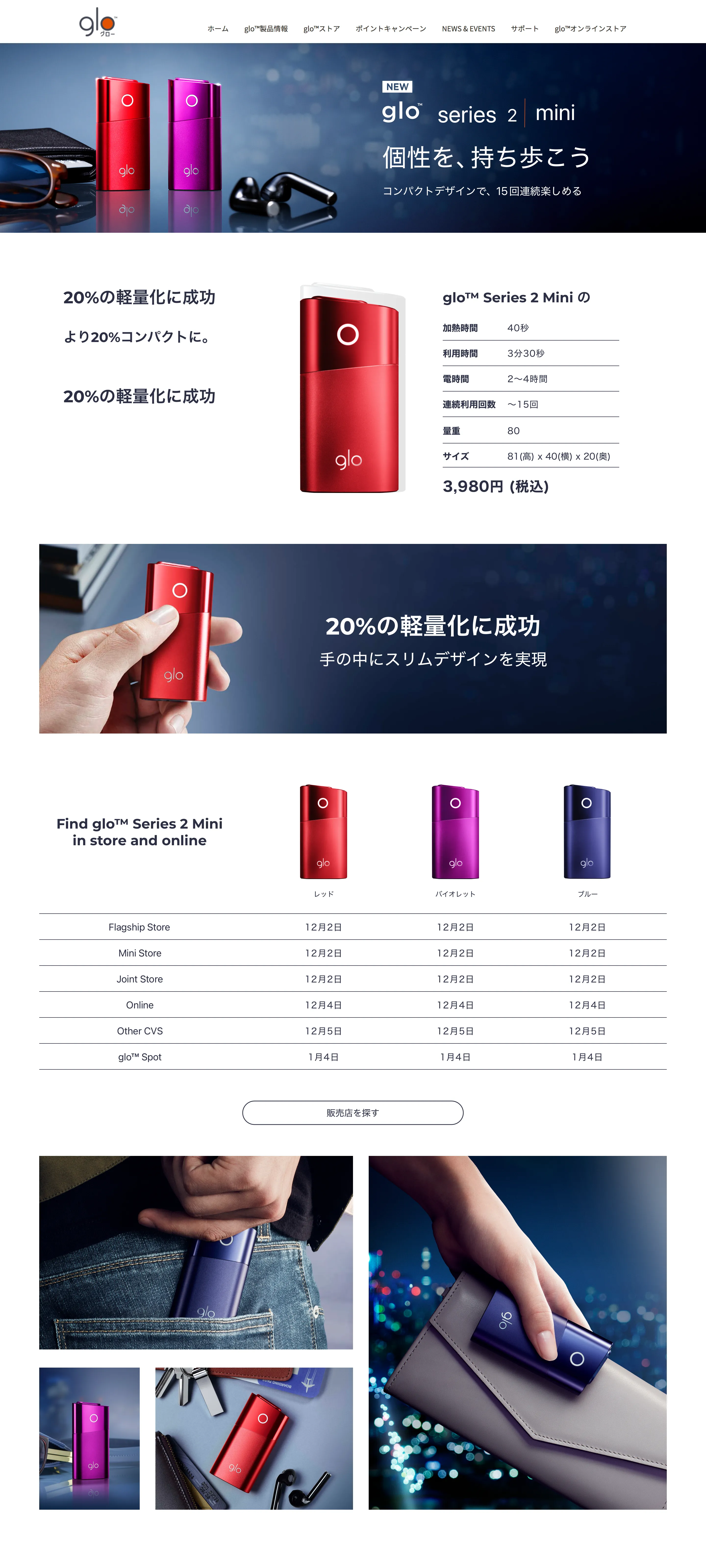
glo Series 2 Mini — Product Page
When British American Tobacco launched the glo Series 2 Mini — a compact heated tobacco device — I was given full ownership of the product page on discoverglo.jp, a platform serving over 1.2 million monthly visitors.
The existing product pages were walls of marketing banners. Big, loud, scattered across multiple pages. Users had to click through layers just to compare products. The design was built for the brand's voice, not for the user's understanding.
I took a different approach. Everything on one page. Clean white background. Product specs visible and comparable at a glance. The device photography given room to breathe. Clarity over volume. Users could understand the product without being screamed at.
The client's response was immediate: give them the whole landing page.
discoverglo.jp — Full Landing Page Redesign
With the UX Director, I redesigned the main discoverglo.jp experience. The work centered on three principles:
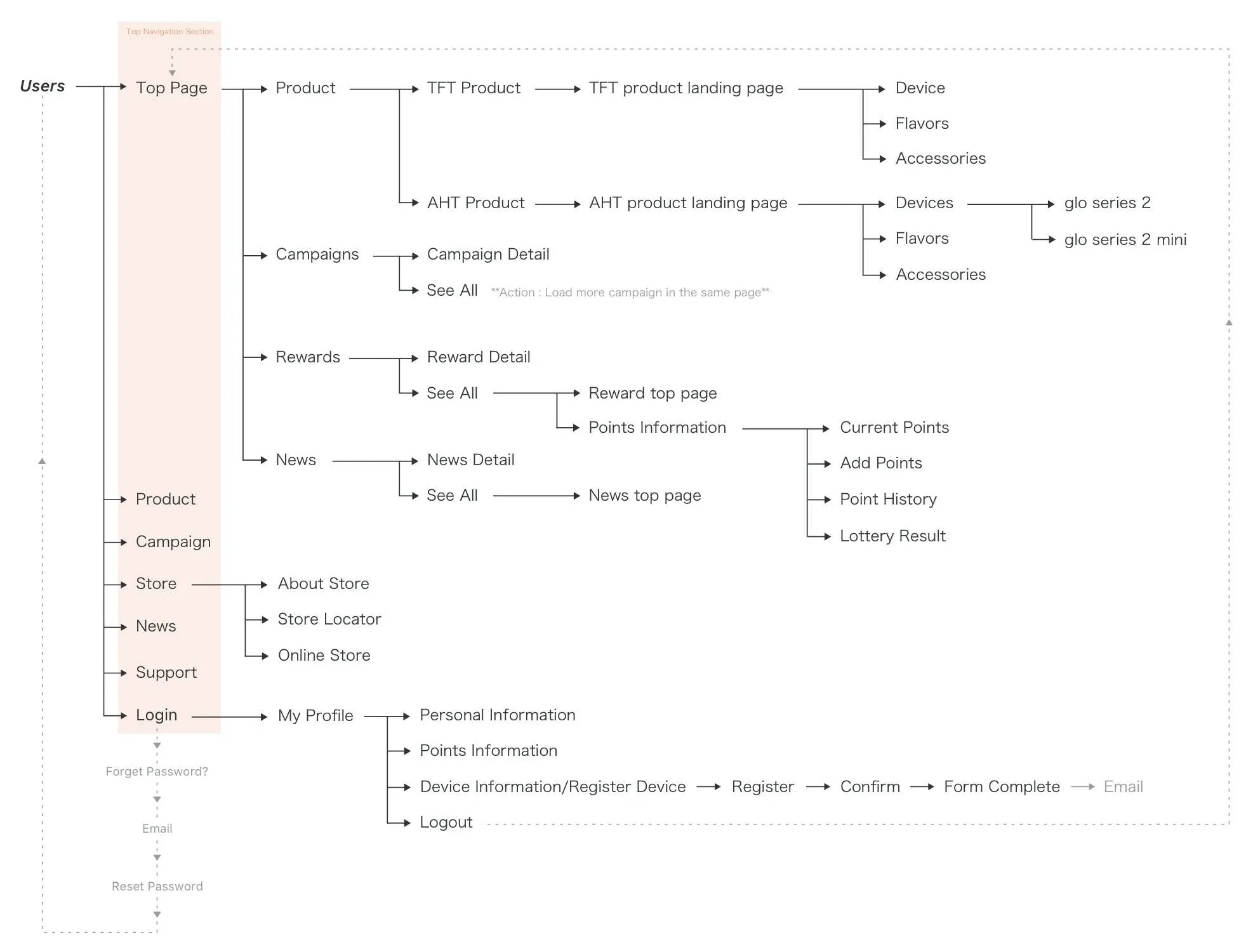
Simplify. The previous site had cluttered navigation and buried content behind banners. I restructured the information architecture — simplified navigation, introduced card-based layouts for campaigns and news, and made the content hierarchy serve the user's journey rather than the marketing calendar.
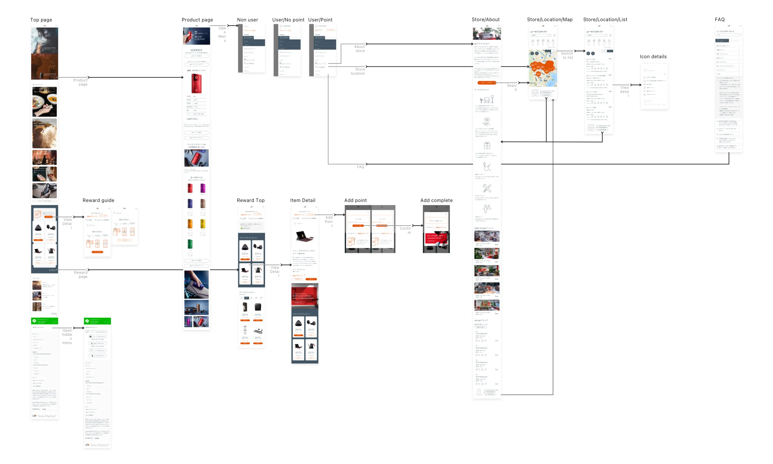
Re-categorize. Products, campaigns, rewards, news, store locations — all reorganized with consistent interaction patterns so users could build familiarity as they moved through the site.
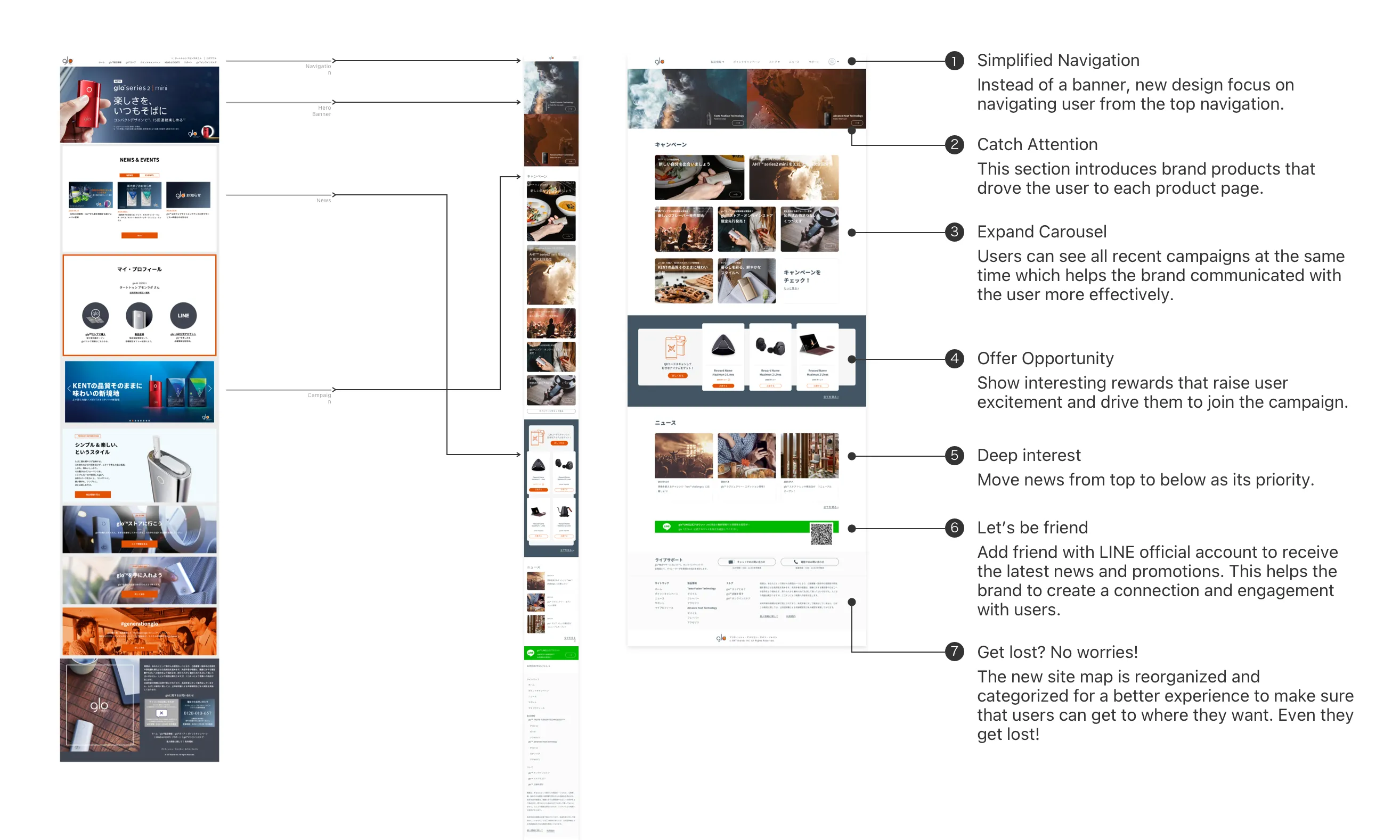
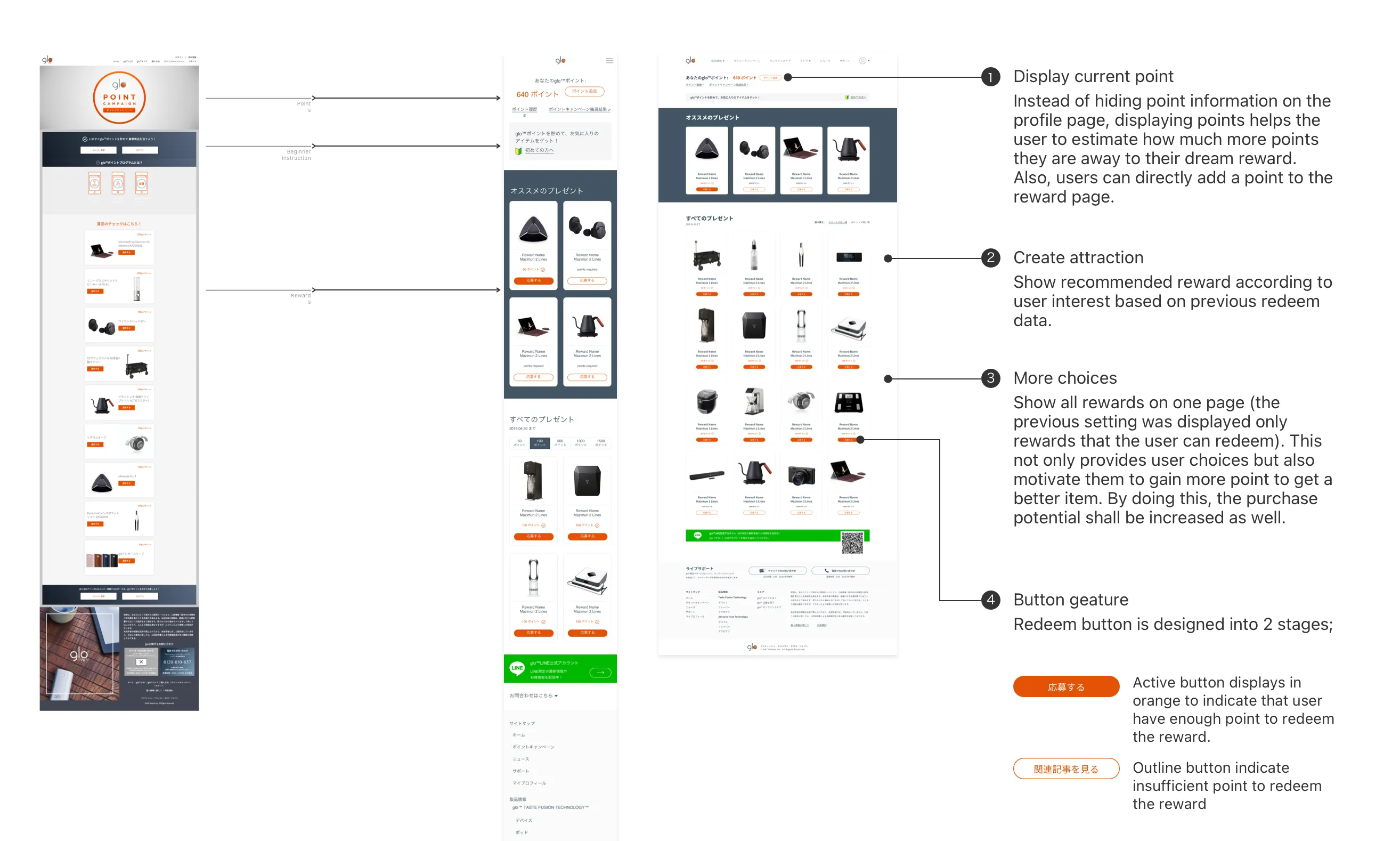
Prioritize. The rewards page was redesigned to show all available rewards (not just redeemable ones), motivating users to earn more points. Current point balance was surfaced directly on the page instead of being hidden in the profile.
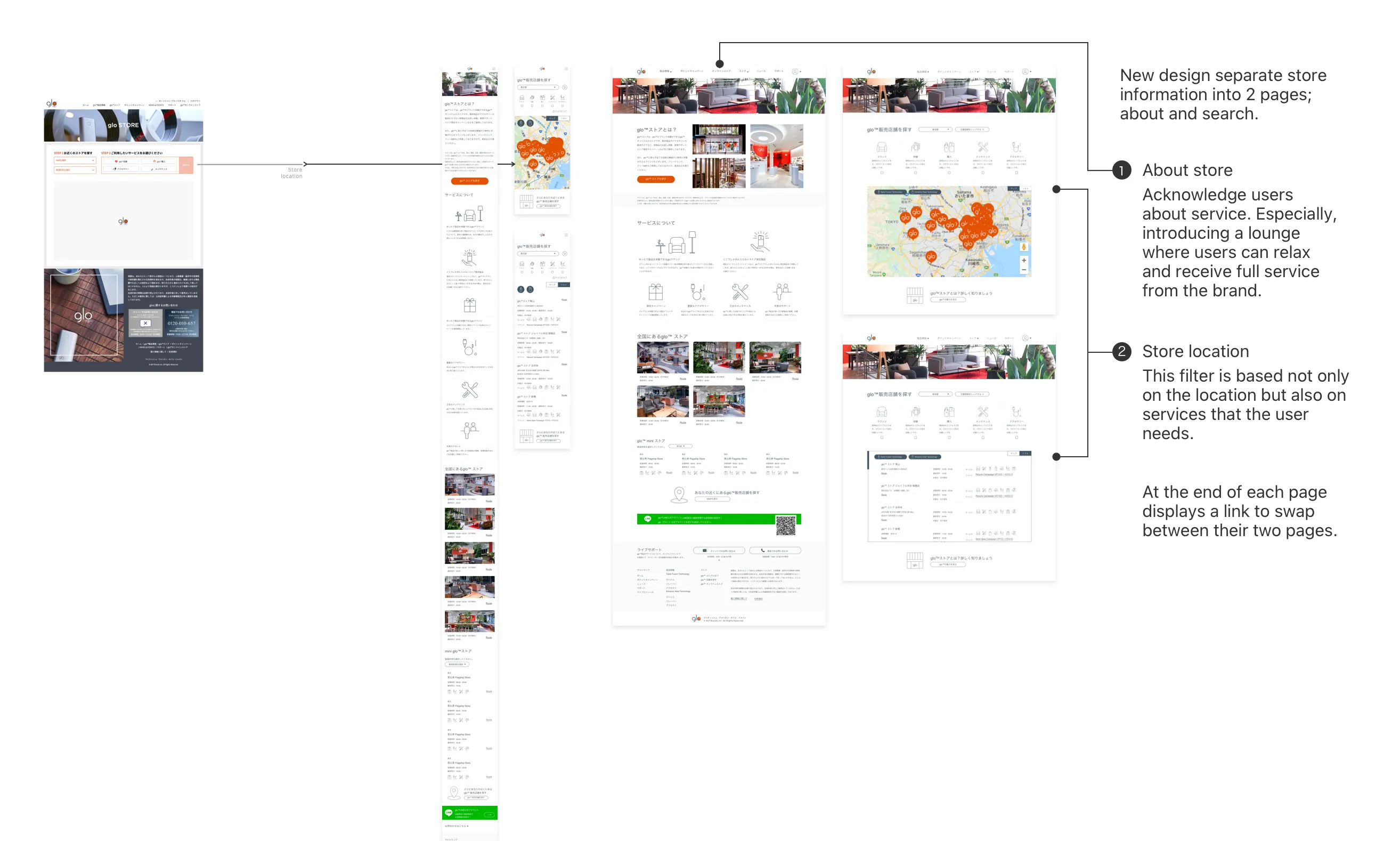
The store page was split into two clear views: "about" (introducing the lounge experience) and "search" (finding locations by service type).
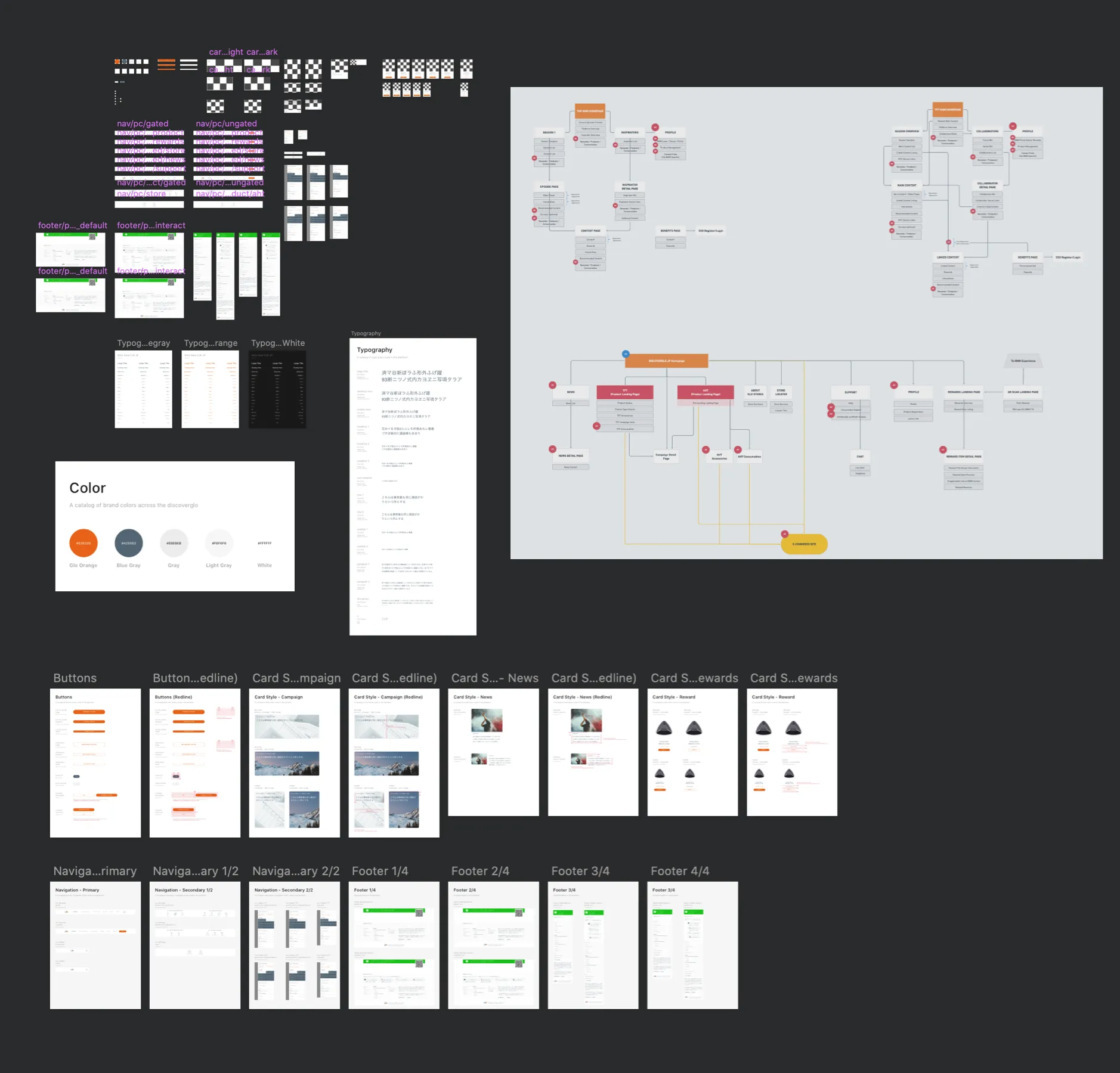
I designed every component, icon, and visual guideline — building a design system that gave the brand consistency it didn't have before.
glo Series 2 Mini — Launch Experience
This was the project that expanded my role beyond screens. Working with the UX Director and the events team, I designed the end-to-end launch experience for the glo Series 2 Mini:
Online: Campaign landing page, event registration flow, and pre-event communications.
Offline: The pop-up event itself — not just a product demo, but an experience. Attendees could discover their ideal tobacco flavor through a guided tasting journey, explore the glo lounge concept, and engage with the brand beyond the device. I designed the event concept, the experience flow, and all touchpoint materials.
The event was designed to do what the product page did at a different scale: replace marketing noise with memorable experience.
Lexus — Landing Page Redesign
I also designed a new landing page for Lexus, focused on their editorial content — articles and events, not vehicle models. I presented the work directly to Lexus leadership alongside my UX Director. A brief but sharp project that demonstrated range beyond the tobacco vertical.
British American Tobacco — Marketing Portal
A separate engagement: redesigning the internal marketing portal for BAT at their offices. Not user-facing, but another signal of the trust the agency placed in me for client-critical work.
The impact
Scope earned
In 11 months, I went from making campaign banners to designing a full product launch experience — from digital production to UX strategy. Not through a title change, but through the quality of each deliverable earning the next opportunity.
Relationships built
The UX Director became a close collaborator and friend. The PMs, the colleagues — we're still in touch today. In agency life, where people cycle through quickly, lasting relationships are a signal of how you worked, not just what you shipped.
Range demonstrated
Across one contract: product pages, full site redesigns, launch event experiences, editorial landing pages, and marketing portals. Campaign-level craft. Product-level thinking. Brand-level consistency.
The lesson
Agency work teaches you to be fast, precise, and versatile. But the real lesson of Ogilvy was about earning scope. Every well-executed banner was a step toward owning a product page. Every clean product page was a step toward redesigning the platform. Every platform redesign was a step toward designing the launch experience.